PAMELA GRAY
Project Focus
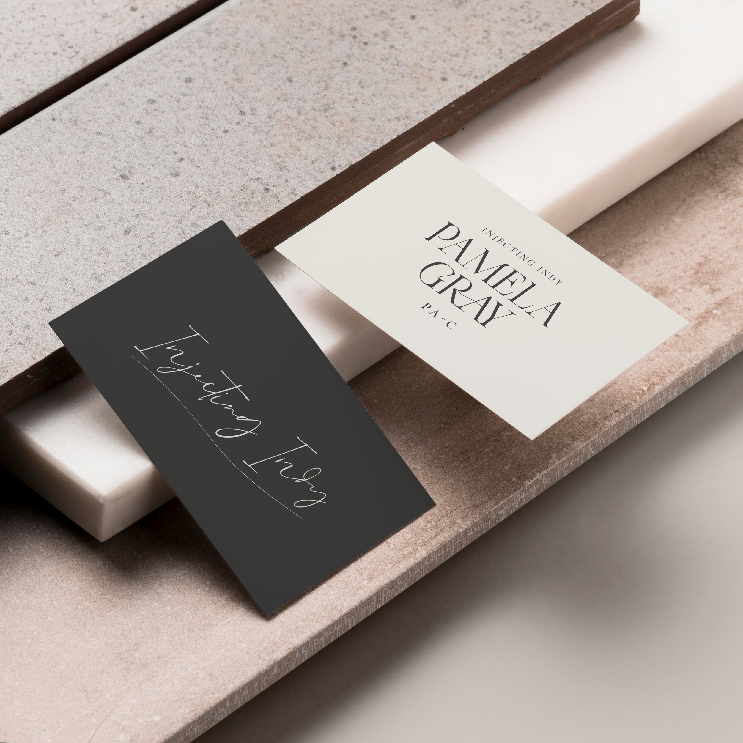
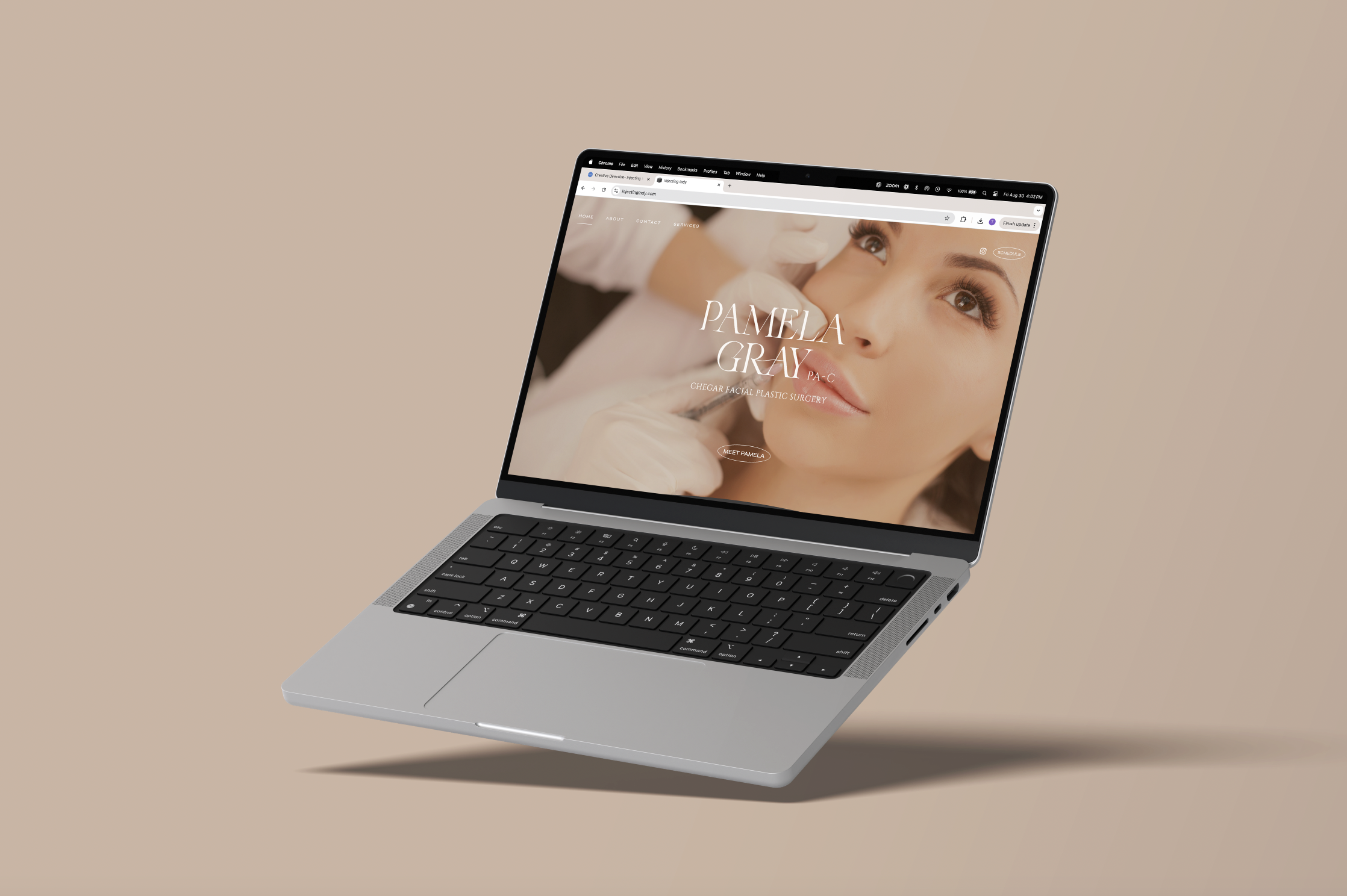
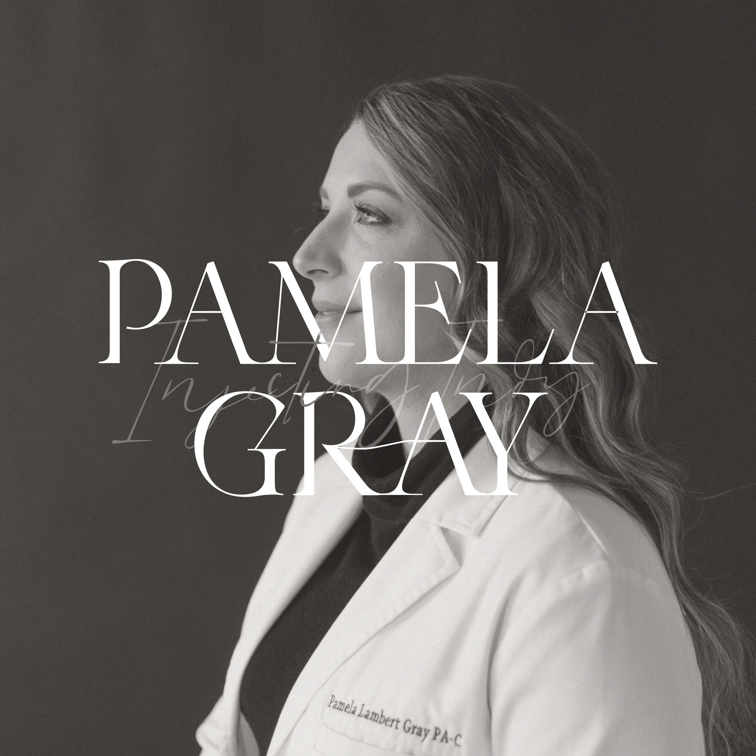
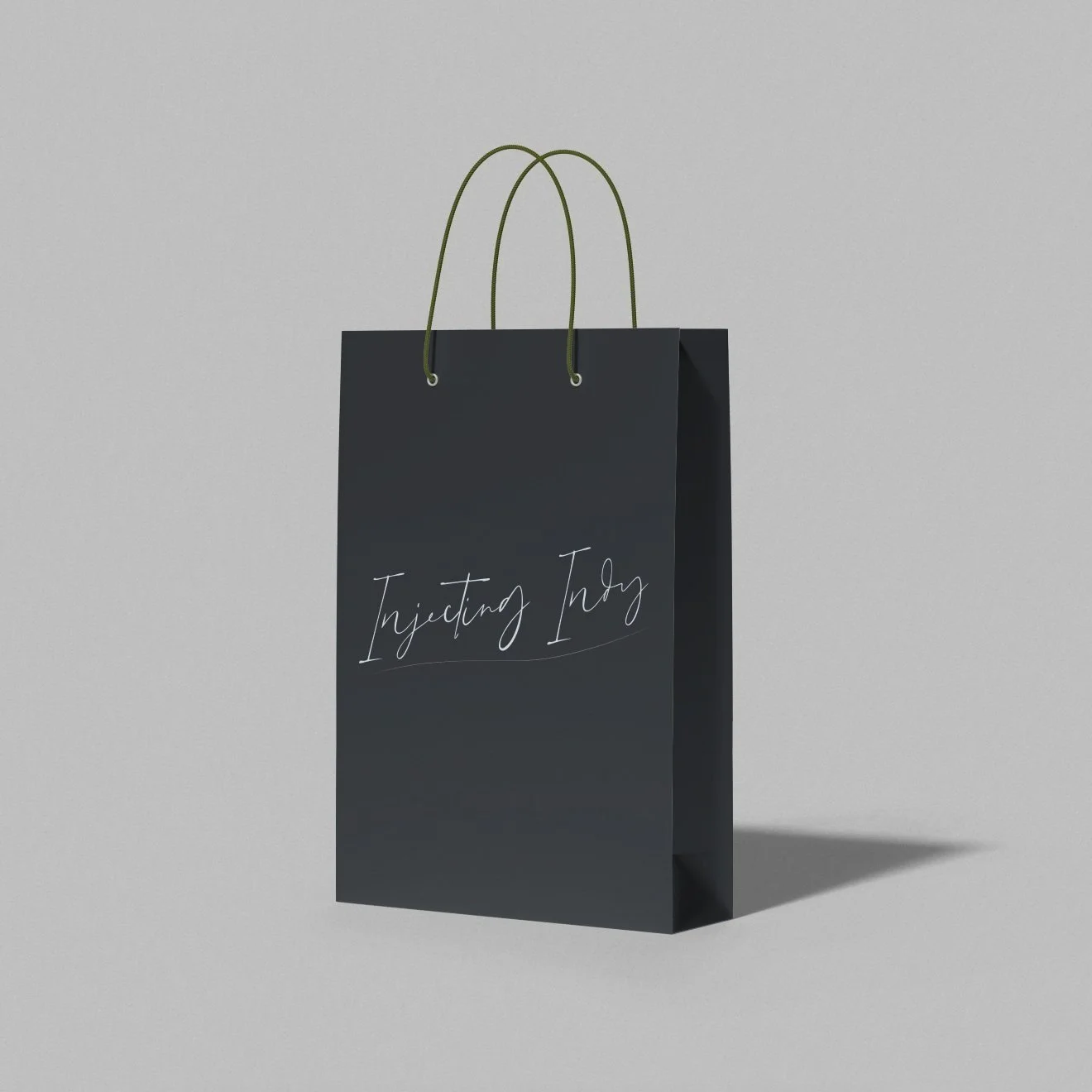
Creating two distinct brand identities— one for Pamela Gray, PA-C, and another for her medspa, Injecting Indy.
Overview
Pamela came with a clear vision: she wanted to break away from the stereotypical medspa aesthetics. No opulent, shiny, or tacky designs. Instead, she wanted a brand that felt organic, approachable, natural, and accessible—much like her own personality.
Challenge + Solution
The challenge was to craft a brand identity that avoided the typical medspa clichés while still appealing to a clientele that values both expertise and comfort. The solution was a design that emphasized simplicity and authenticity, with a focus on natural elements and approachable visuals that reflect Pamela’s laid-back vibe and deep knowledge.
Approach
To align with Pamela’s vision, I created two cohesive brand identities. The personal brand for Pamela Gray, PA-C, highlighted her professional expertise in a way that felt authentic and approachable, while the Injecting Indy identity focused on the medspa’s commitment to natural beauty and well-being. Organic textures, soft color palettes, and simple, clean lines defined both identities, steering clear of anything that felt overly glittery or artificial.

Relationship
Collaborating with Pamela was a refreshing experience. Her laid-back yet highly knowledgeable approach made the process both enjoyable and insightful. We bonded over our shared taste for understated elegance and our mutual disdain for over-the-top aesthetics. Working together felt more like a creative partnership than a typical client relationship—I’d gladly hang out with her in Napa any day!

Strategy
The strategy was to differentiate Injecting Indy in a crowded market by emphasizing a more organic and accessible approach to beauty. This meant not only designing a visually distinct brand but also crafting messaging that resonated with clients seeking a more natural and personalized experience. Pamela’s personal brand as a PA-C was positioned as the knowledgeable yet approachable expert, bridging the gap between professionalism and warmth.
Design System
The design system for both brands was rooted in simplicity and natural beauty. For Injecting Indy, I used earthy tones, organic patterns, and soft typography to create a calming and welcoming atmosphere. Pamela Gray’s personal brand focused on clean lines and subtle sophistication, reinforcing her credibility while maintaining a friendly and approachable feel. Both identities were unified by a consistent visual language that felt authentic and grounded, yet elevated.