NOTHING IS WASTED
PROJECT
Bringing the heart of the Nothing is Wasted message to life through intentional design and cohesive creative direction, ensuring every visual detail communicates hope, transformation, and resilience.
OVERVIEW
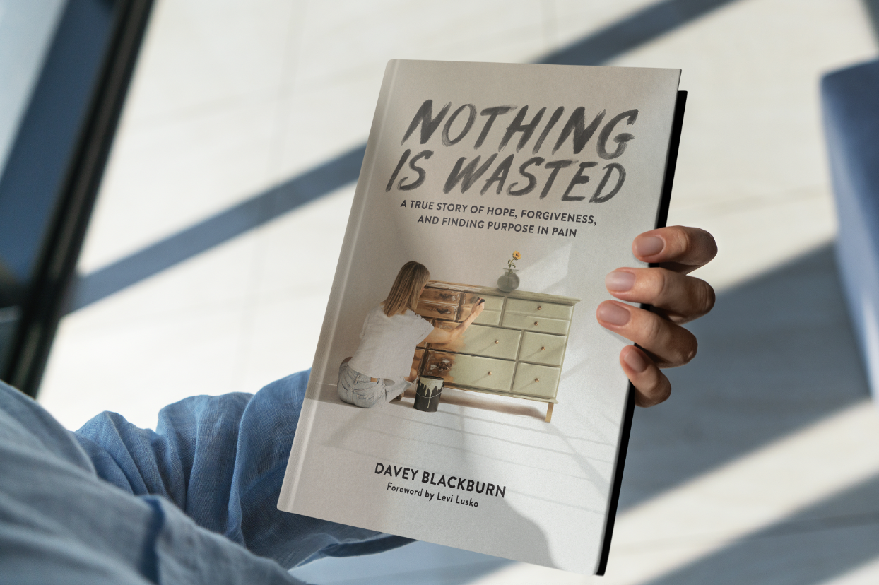
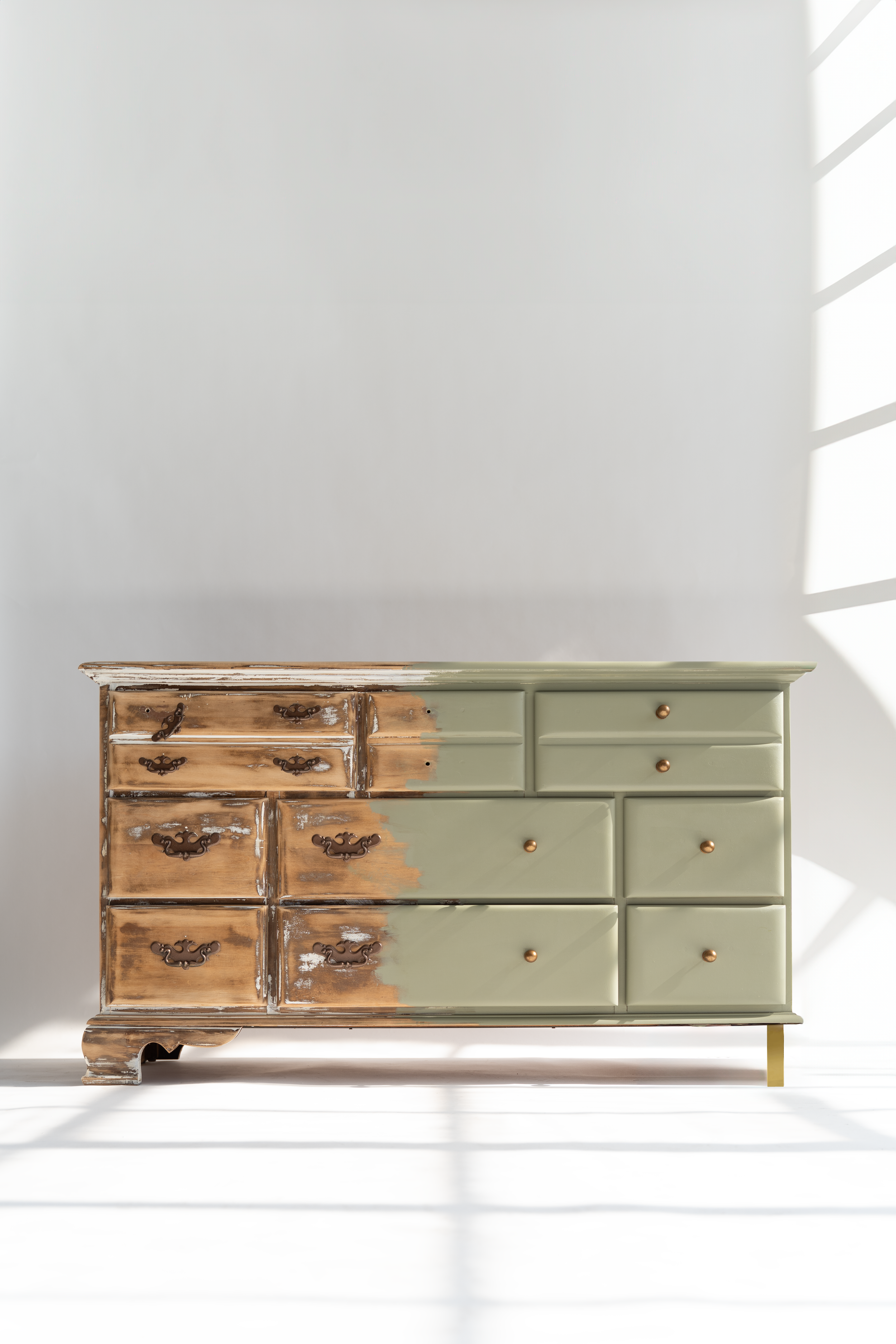
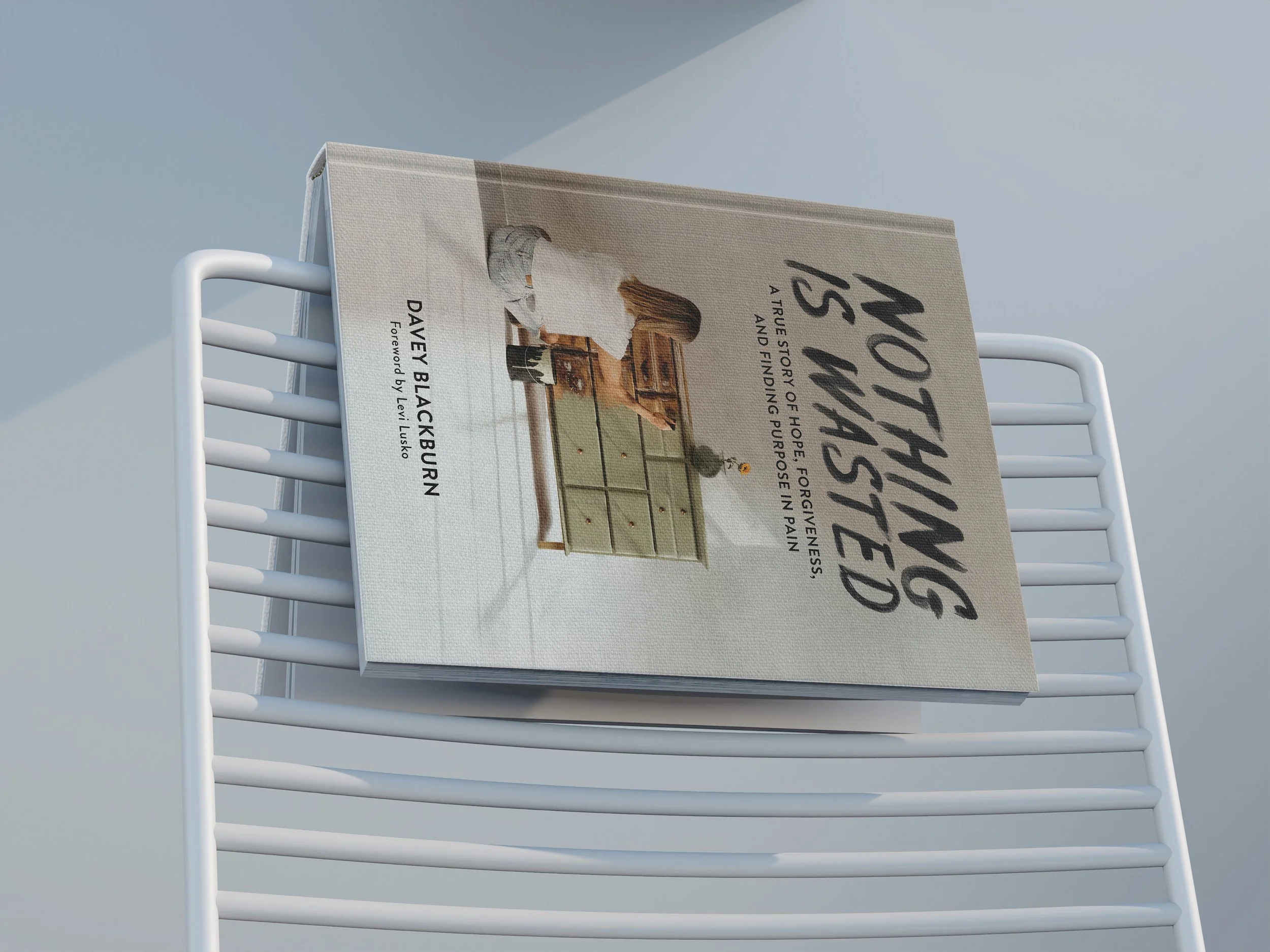
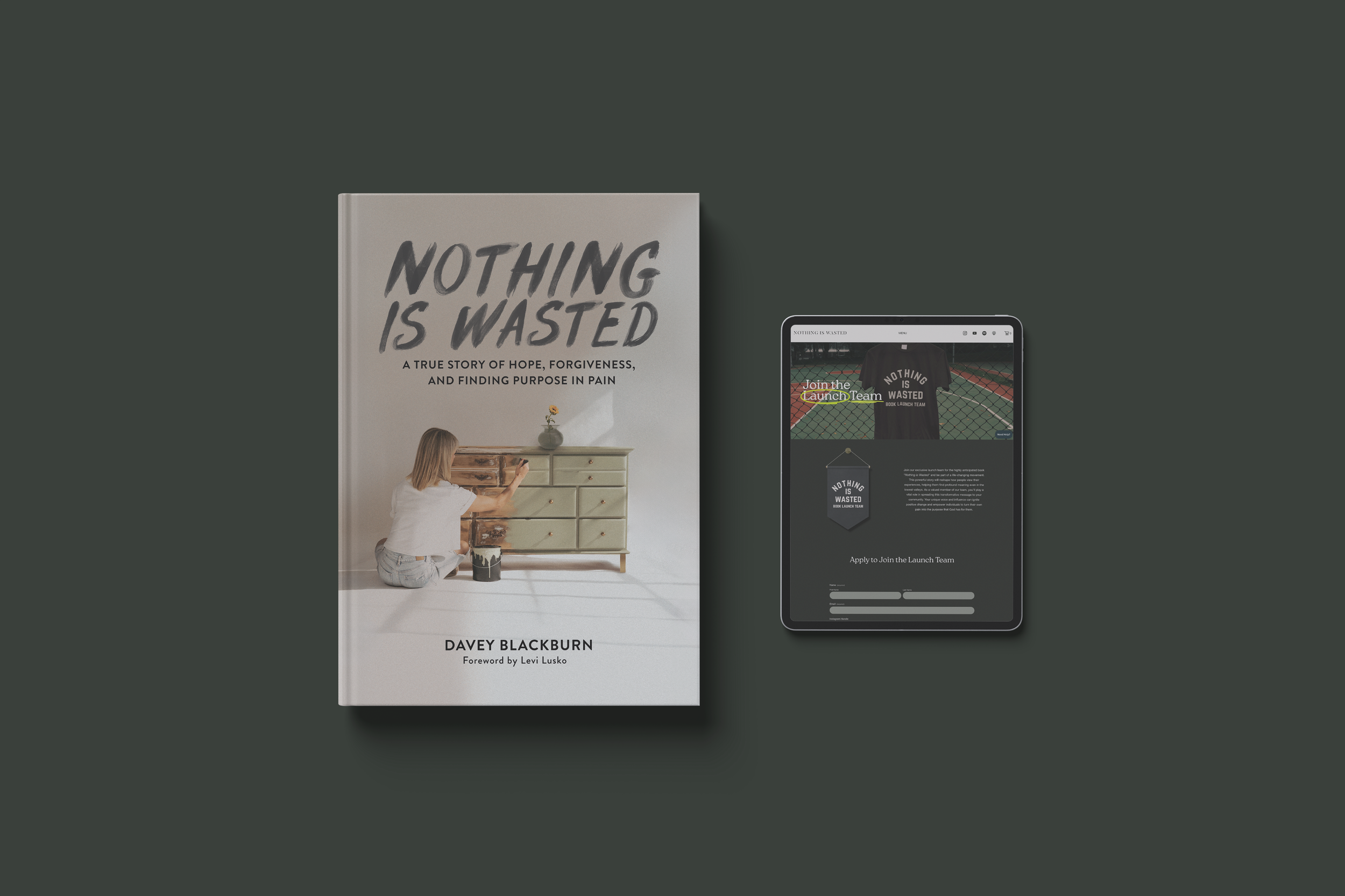
The Nothing is Wasted book was a deeply personal project, telling the story of hope and restoration through the lens of Amanda Blackburn’s life and legacy. The cover, featuring Amanda’s sister Amber, was carefully designed to weave symbolism into every element. The centerpiece—a weathered dresser—represents Amanda’s furniture business, Weathered Willow, while also reflecting the broader theme of restoration and renewal. Photographed by HOTPLATE Media at the historic Stutz building in Indianapolis, the imagery brought a raw and authentic texture to the project. My role extended beyond the book’s design to include promotional assets that carried this message of resilience across platforms, ensuring the story resonated with audiences long after the final page.
RELATIONSHIP
This project wasn’t just a job—it was a collaboration built on purpose and shared belief in the book’s transformative message. Working with the Nothing is Wasted team felt like partnering with kindred spirits, as we poured our creativity and hearts into a project that sought to inspire healing and hope.
APPROACH
My approach centered on reflecting the raw yet redemptive tone of the book. The design was clean and modern, yet filled with warmth and intentionality. I focused on typography and layout choices that were easy to read while maintaining an elevated feel. For the cover, I leaned into minimalism paired with symbolic imagery, allowing the message of resilience to shine. I extended this visual style into marketing assets, creating a cohesive experience that bridged the book and its audience.
STRATEGY
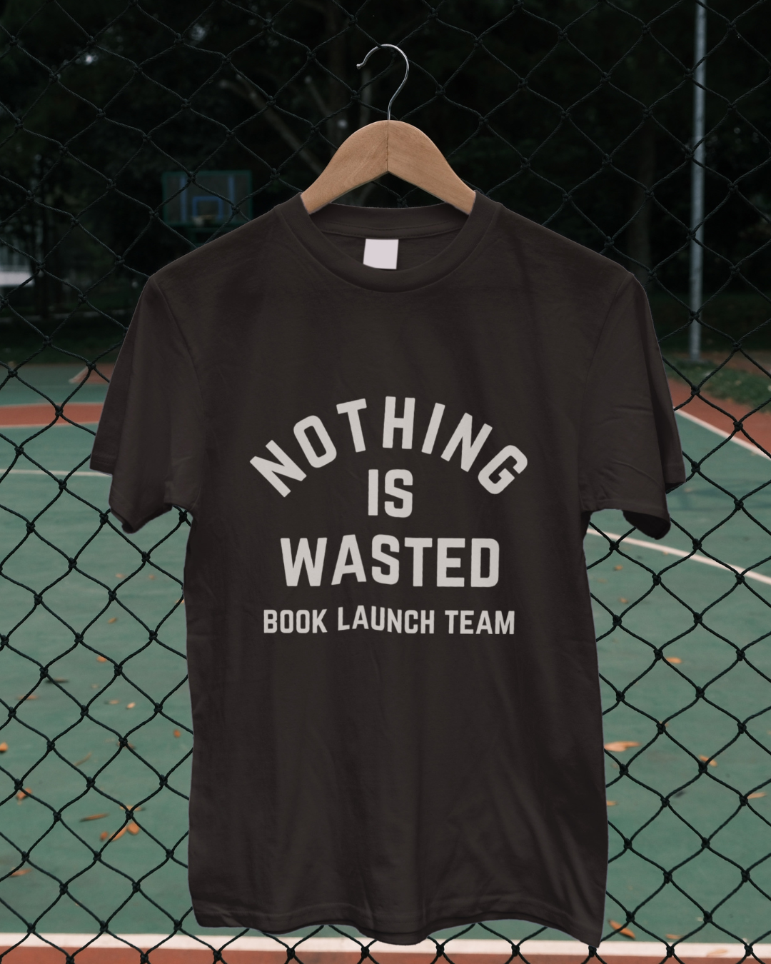
The strategy was rooted in creating a cohesive narrative across every touchpoint. The book’s design was complemented by a suite of promotional materials, including social media graphics, event signage, and launch campaign assets. By aligning the visual style with the book’s tone, we created an immersive experience that supported its themes of healing and redemption, ensuring that the message resonated beyond the page.
CHALLENGE + SOLUTION
The challenge was to translate the book’s complex, emotional message into visuals that felt both inspiring and approachable. The solution was a design that embraced simplicity and authenticity, with thoughtful details that invited readers into the journey. From designing the book’s interior to crafting graphics for a multi-platform promotional campaign, each element was created with care to amplify the book’s voice and connect with its audience.
DESIGN SYSTEM
The design system centered on clean lines, timeless typography, and a soothing yet powerful color palette. The interior pages featured thoughtful spacing and easy-to-read layouts to guide readers through the book effortlessly. The cover incorporated symbolic visuals to encapsulate the book’s essence. Promotional materials maintained this aesthetic, ensuring that every piece—whether digital or print—felt like a seamless extension of the book.