HOTPLATE

Project Focus
Building a high-fashion, gritty brand identity for HOTPLATE, a media company specializing in real estate photography and videography.
Overview
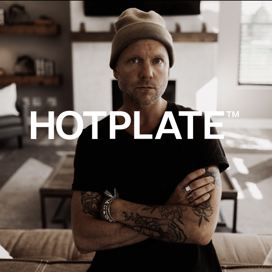
Nathan, with his unique style and background as a touring musician, sought a brand that would reflect his distinctive approach to media. He wanted something that blended high fashion with a raw, backstage vibe—something that would set HOTPLATE Media apart in the competitive real estate photography market.
Challenge + Solution
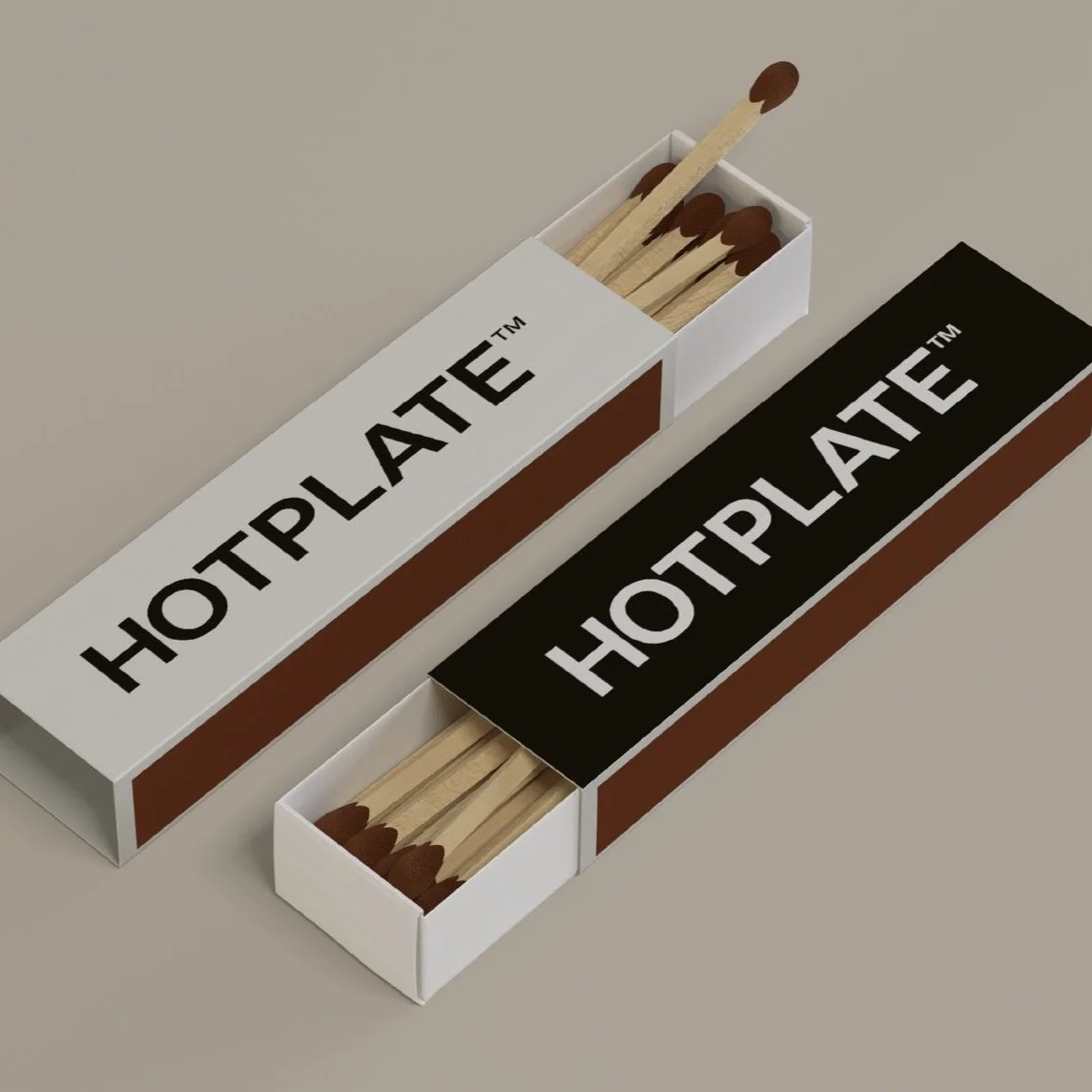
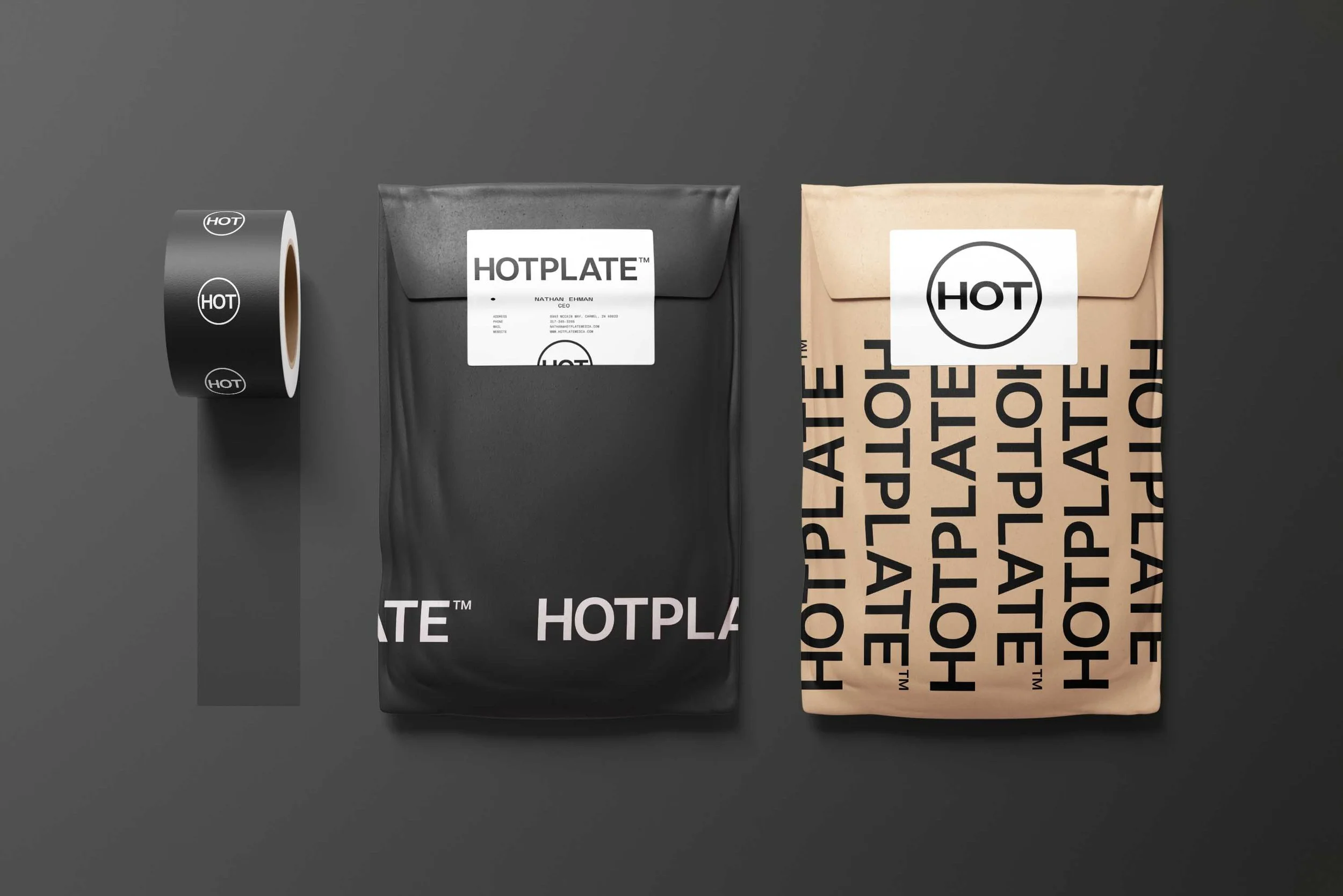
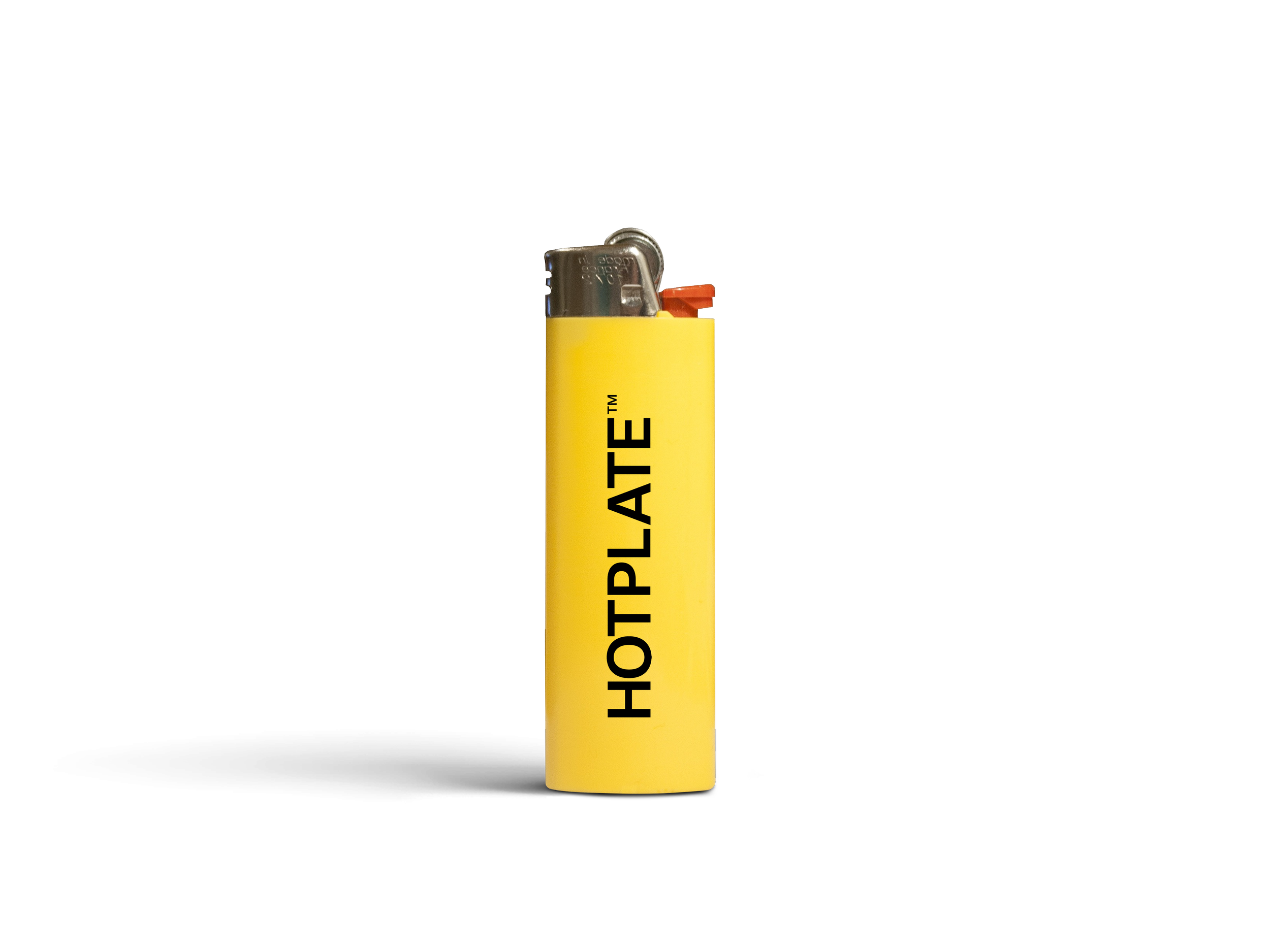
The challenge was balancing the “HOT” name with Nathan’s high-fashion, gritty vision without being too on-the-nose. The solution was to create a brand identity that played off the “HOT” concept subtly, using fire elements in a way that felt edgy and sophisticated. The visual language was designed to evoke the raw energy of a backstage concert scene while maintaining a polished, professional edge.
Approach
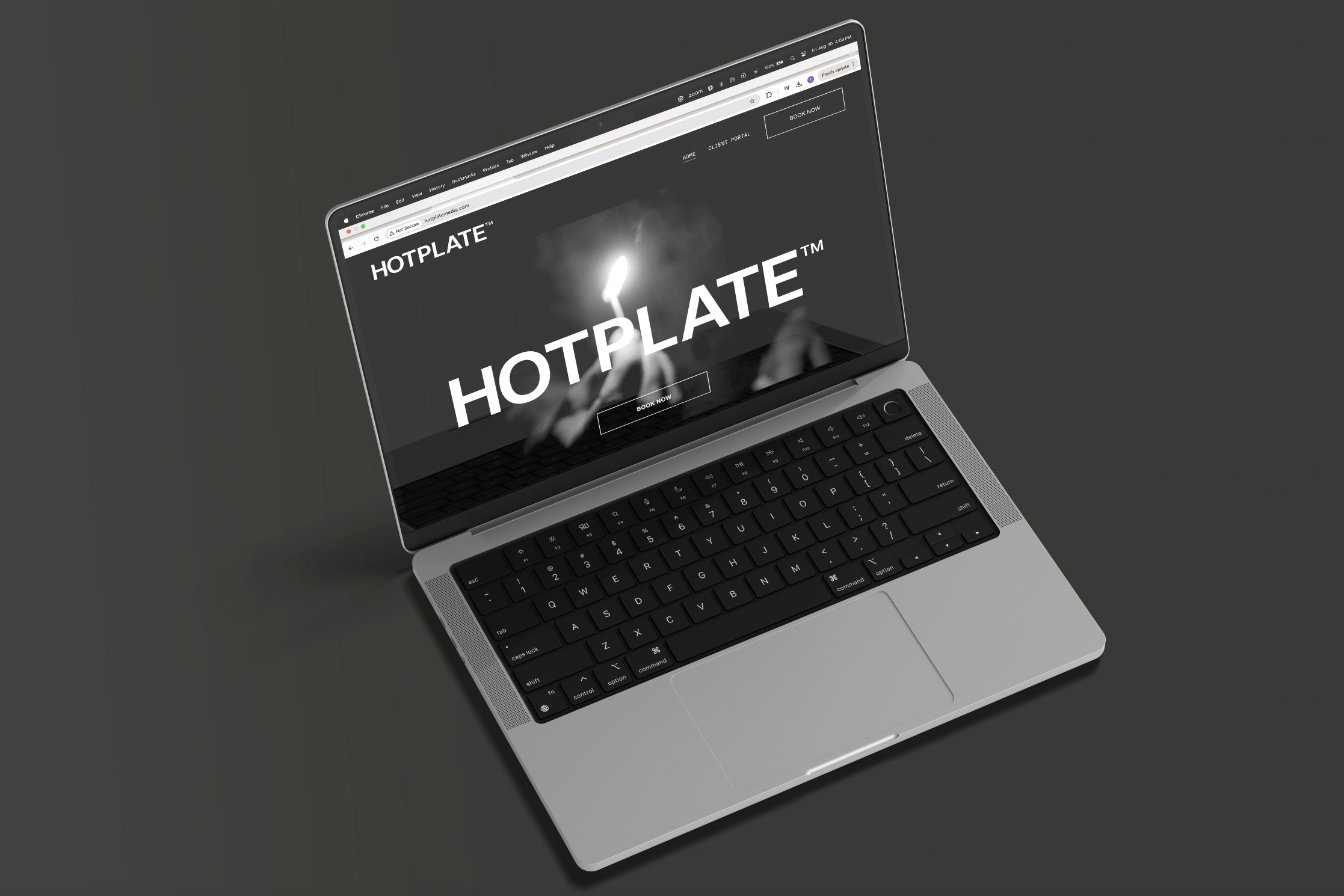
To capture Nathan’s vision, I focused on creating a brand that was both striking and memorable. The “HOT” logomark became the centerpiece of the identity, with fire elements woven throughout in a way that was more about mood than literal flames. The brand video was directed to emphasize this gritty, high-fashion aesthetic, using lighting and editing techniques that mirrored the raw energy of a live show. The website followed suit, with bold typography and dark, textured backgrounds that reinforced the brand’s unique vibe.
Relationship
Working with Nathan was a dynamic, collaborative process. His background as a musician brought a creative energy to the project, and we worked closely to ensure that every element of the brand reflected his style. Our relationship was built on mutual respect for each other’s creativity, and this vibe allowed us to create something truly unique.
Strategy
The strategy was to position HOTPLATE Media as a standout in the real estate photography industry by emphasizing its unique blend of high fashion and grit. We focused on creating a visual identity that would attract clients who appreciate creativity and quality, while also appealing to Nathan’s existing network in the music and creative industries. The brand video served as a key marketing tool, showcasing HOTPLATE Media’s capabilities in a way that felt both polished and authentic.
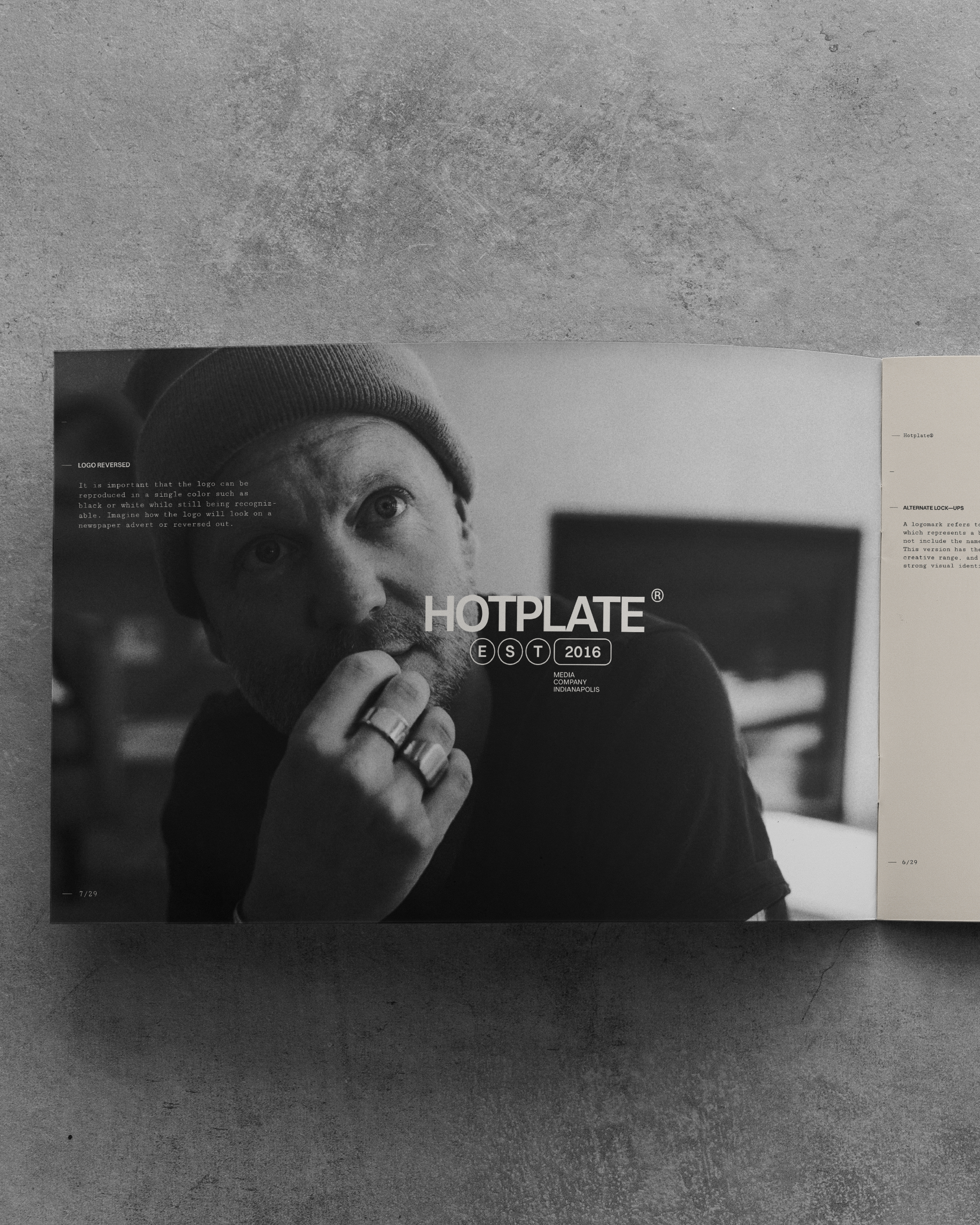
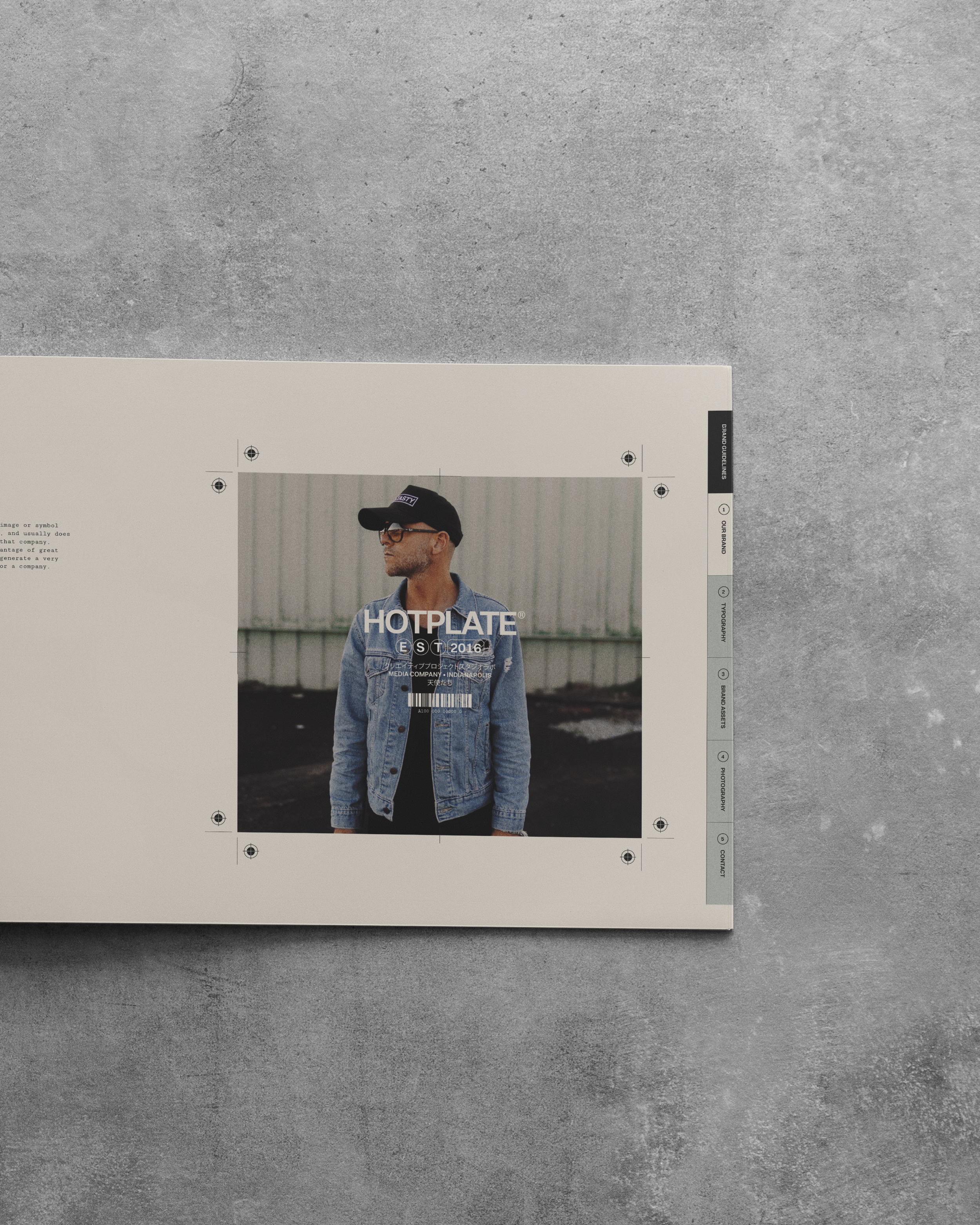
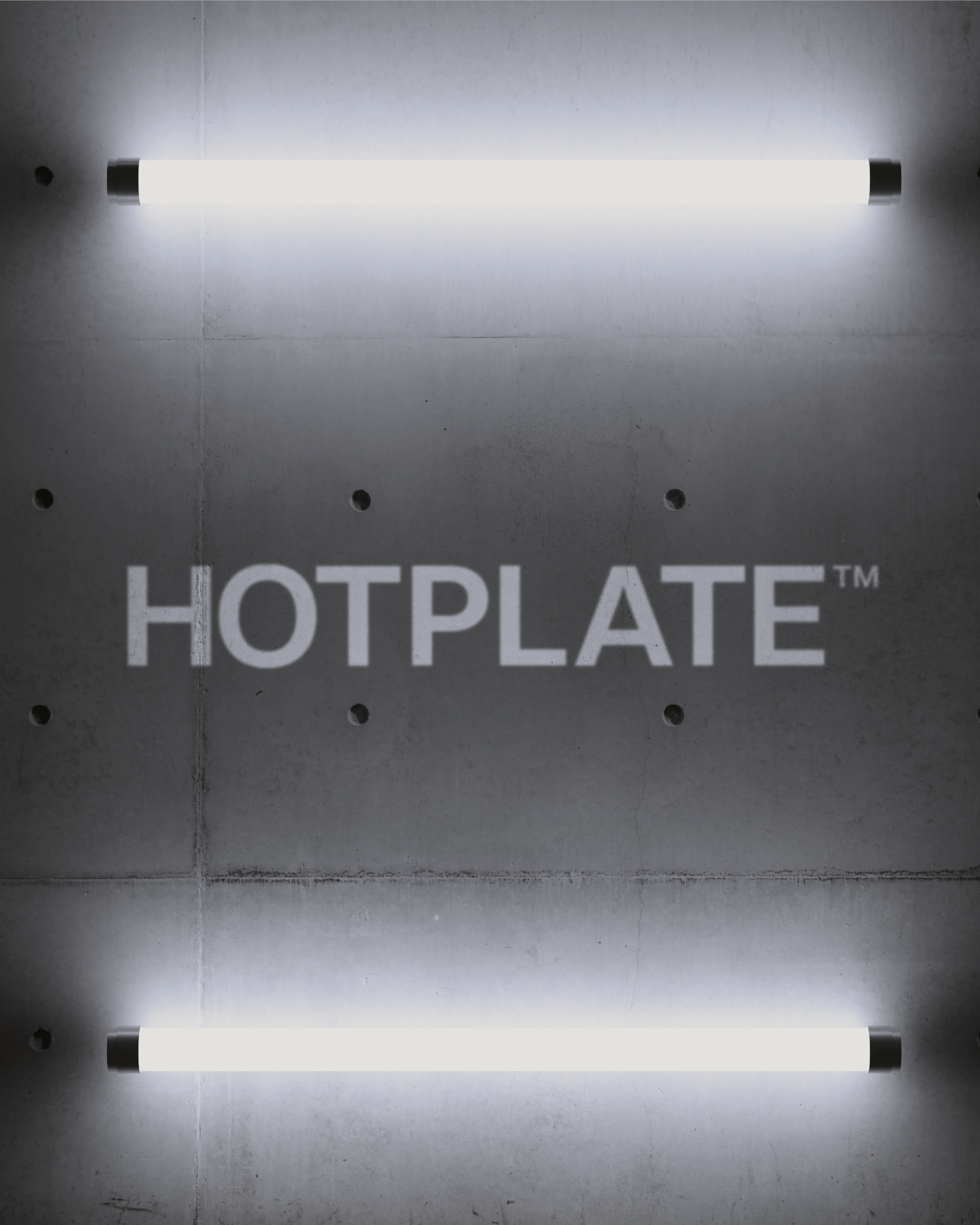
Design System
The design system was built around the “HOT” logomark, with fire elements subtly integrated into the overall aesthetic. The color palette was dark and moody, with pops of bright white to create visual interest. Typography was bold and modern, complementing the gritty, backstage feel of the brand. The website was designed to be visually engaging, with large video and minimal type that drew visitors in and showcased the company’s work.